

Makenna Koffee- Responsive Web Redesign
Makenna Koffee is a local business in Simi Valley, California. Open in 2019 and offers a variety of hot and cold Tea, coffee, beverages and also provides a range of delectable pastries and snacks to accompany with the beverages.
Problem
The website appears poorly designed, resembling a static page with limited functionality.
It lacks updated information on beverages, displaying outdated options the company no longer sells.
There is insufficient detailed information about the ingredients and components of each drink.
The company offers beverage customization, but users cannot save their customized drinks for future orders.
Solution
Conducted comprehensive research into the business objectives.
Assessed the current state of the business through consultations with owners and customers.
Brainstormed and developed a detailed, refined prototype.
The prototype addresses existing website navigation challenges.
Focus on enhancing user experience for Simi Valley residents placing online coffee orders.
Aim to attract a larger customer base and encourage more successful transactions.
Tool Used
Figma, Adobe Illustrator.
My Role
Solo UX/UI designer
1. Research
The project's primary objective was to enhance the online visibility of an existing business. My initial approach involved a thorough evaluation of the current website's shortcomings and their impact on the business and customers. The audit included interviews with the business owner and potential customers interested in gardening products. Additionally, I analyzed competitors in the e-commerce space to understand how they address similar website challenges.
Research Objective
Creating a responsive website which is easy to navigate on all devices.
Creating the homepage and value proposition of all drinks need to be redesigned, as well as a customization page to enhance the user experience and provide more engaging features.
Create a functionality for users to save their customised beverages for future orders.
Affinity Map from 1 on 1 Interview
After talking to the people involved, I watched how each of them used the Makenna Koffee website and wrote down what they liked and didn't like. I also noted down what they expected from the website. I put all this information into different groups to make it easier to understand. Just like I thought, I found some problems in how people use the website, mostly because it's not very easy to use.

Key Takeaway from test
The landing page of the website is confusing, user can not see all the details of Drinks there.
Customization of the coffee or any drinks is not user friendly since user can not see the required field and optional field of customization page.
Some CTA buttons are not functional.
color contrast was not there on few pages of the website.
Website Audit
Conducted interviews focused on usability heuristic principles.
Gathered feedback and viewpoints on participants' interactions with the website.
Focused on the website's most frequently visited pages to identify significant issues.
Primary challenges identified were related to drink customization.
Less experienced users faced difficulties navigating these flows, impeding progress towards the ultimate goal.Here are some snapshots of current website pages.

Competitive Analysis

2. Define
User Persona
Upon conducting an analysis of the user interview and synthesizing the data into an affinity map, I was able to promptly identify distinct user groups and their corresponding categories.

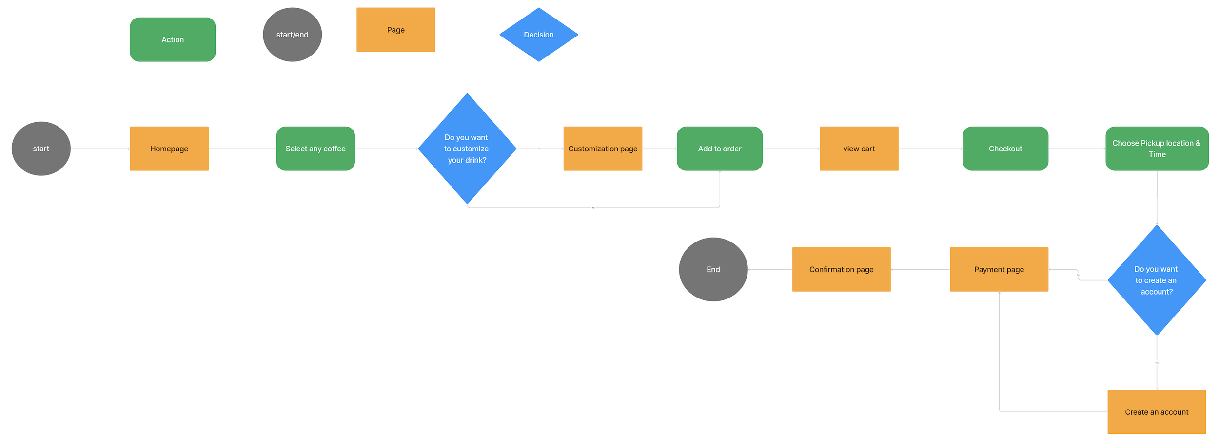
User-Flow
Improving website navigation was crucial for this project as it directly impacts usability and visitor retention. Given that the business's main revenue comes from selling coffee and drinks, we focused on optimizing the key process: finding a coffee, customizing it, adding it to the cart, and completing the purchase.
3. Implementation
Sketched Wireframes
Once I felt assured that I had gathered sufficient data to begin creating solutions, I initiated the process of sketching out diverse concepts suitable for the pages integral to the aforementioned flows. Recognizing the importance of ensuring website adaptability, I also crafted mobile wireframes for essential pages.

Brand Identity
Makenna Koffee had a logo and a special style that people recognized. After seeing how people used the website, I decided to update how it looked because the old design didn't work well anymore.
I made sure to keep the brand's original feeling and what makes it special, especially since it has been around since 2019. While I kept its classic charm, I chose a new way to show the brand's name using a special design. I also added a background design that goes well with it. This made the brand look classy, modern, and easy to remember.
As part of this change, I used a flower from the old logo but mixed it with letters to give a tropical feel to the brand. This way, the brand's unique character really comes through.

Style Tile
Before creating detailed screens, I established key design elements for Makenna Koffee's website, including a new logo, fresh typography, and a visually appealing, accessible color palette.
I started with a mood board featuring images, posters, logos, and colors from similar brands to inspire the design direction. Next, I developed a style tile with a Hawaiian aesthetic to reflect the desired vibe.
After finalizing the style tile, I created a library of reusable components designed to maintain consistency with the established style standards, ensuring a cohesive visual experience throughout the prototype.

High Fidelity Prototype
Once I had the basic design ideas ready, I turned them into simple digital outlines (mid-fidelity wireframes). Then, I made these outlines more detailed and colorful (high-fidelity screens), while making sure they matched the brand's style.
While working on the not-so-detailed outlines, I asked a few people to try them out to make sure I was doing things right. I tried different versions to see what fonts, how text was organized, where the logo fit best, and what colors worked best for the detailed screens. This helped make everything look and work well together.


Usability Testing
Receiving periodic feedback from colleagues and customers during the mid-fidelity stages helped address most functionality concerns. This made it easier to devise a usability testing strategy focused on usability and visual/UI design.
I organized formal usability tests with five participants, following established procedures. Using screen sharing, screen recording, and note-taking, I addressed the most significant and common issues raised by the participants.
The UI design received numerous favorable remarks, and participants found it to be very user-friendly. Every participant successfully navigated through the processes without any difficulty. These were the key performance indicators assessed during the test:
Task completion of flow
Finish the task with minimal errors – 1 or 2 errors but be able to get back to the right path
Less time taken to complete task – Around 2-4 minutes
Overall satisfaction of the flow.
Anyhow along with the positive comments I took down any issues or doubts the participants had while testing out the flows and corrected as per user requirement.


Revised Prototype
Key Learnings
This project enabled me to enhance a real coffee shop's website, achieving a long-standing aspiration from my days as a customer. After its completion, I feel more self-assured in implementing similar improvements for other businesses to support their growth.
From usability testing, I learned that quietly observing users helps me understand how they interact with the website. Starting with open-ended questions encourages users to freely share their thoughts on what they see and how they navigate the site. Allowing them to comment on small details is invaluable for identifying any issues or confusion.
Creating a user-friendly experience requires continuous updates and adjustments to web pages, components, and elements to align with current trends and user needs. I often revisited specific areas multiple times to ensure they met user expectations, focusing on both the interface and overall user experience.
UX design is an ongoing process that can become a never-ending loop if not managed carefully. Prioritizing user groups for testing and organizing feedback based on issue severity and frequency helps streamline design and development, making the process less frustrating.
Next Step
Promote Makenna Koffee's improved online purchasing experience through social media once the interface is fully developed and integrated into the client management system. This ensures customers from across Simi Valley are aware of the convenient online purchasing options available.
Future plans include adding features like product reviews, a chat system for customer support, and expanding the FAQ section as designs evolve. Accurate information availability will be key as online orders and customer base grow.
More Case Studies

Lunch Lineup

Bank of America Feature

Skillhance