

Bank of America
The new feature of 360 degree view of the financial transaction will help users to see all their Non Bank of America Account’s transactions at Bank of America Account.
Problem
Many individuals have accounts with multiple banks.
Lack of a comprehensive view of transactions across these accounts is a significant challenge.
Difficulty in accurately monitoring spending patterns.
Risk of oversight on avoidable expenses.
Potential for exceeding budget limits due to fragmented account information.
Solution
Discovered through research that people use apps from other banks to aggregate their various bank accounts.
This approach allows users to view all transactions in one consolidated interface, simplifying money management.
Proposed adding a new feature to Bank of America to enable users to connect accounts from other banks.
Aimed to provide users with a 360-degree view of their finances within Bank of America's platform.
Intended to enhance user convenience and financial management capabilities.
Tool Used
Figma, Adobe illustrator.
My Role
Solo Product Designer
Research
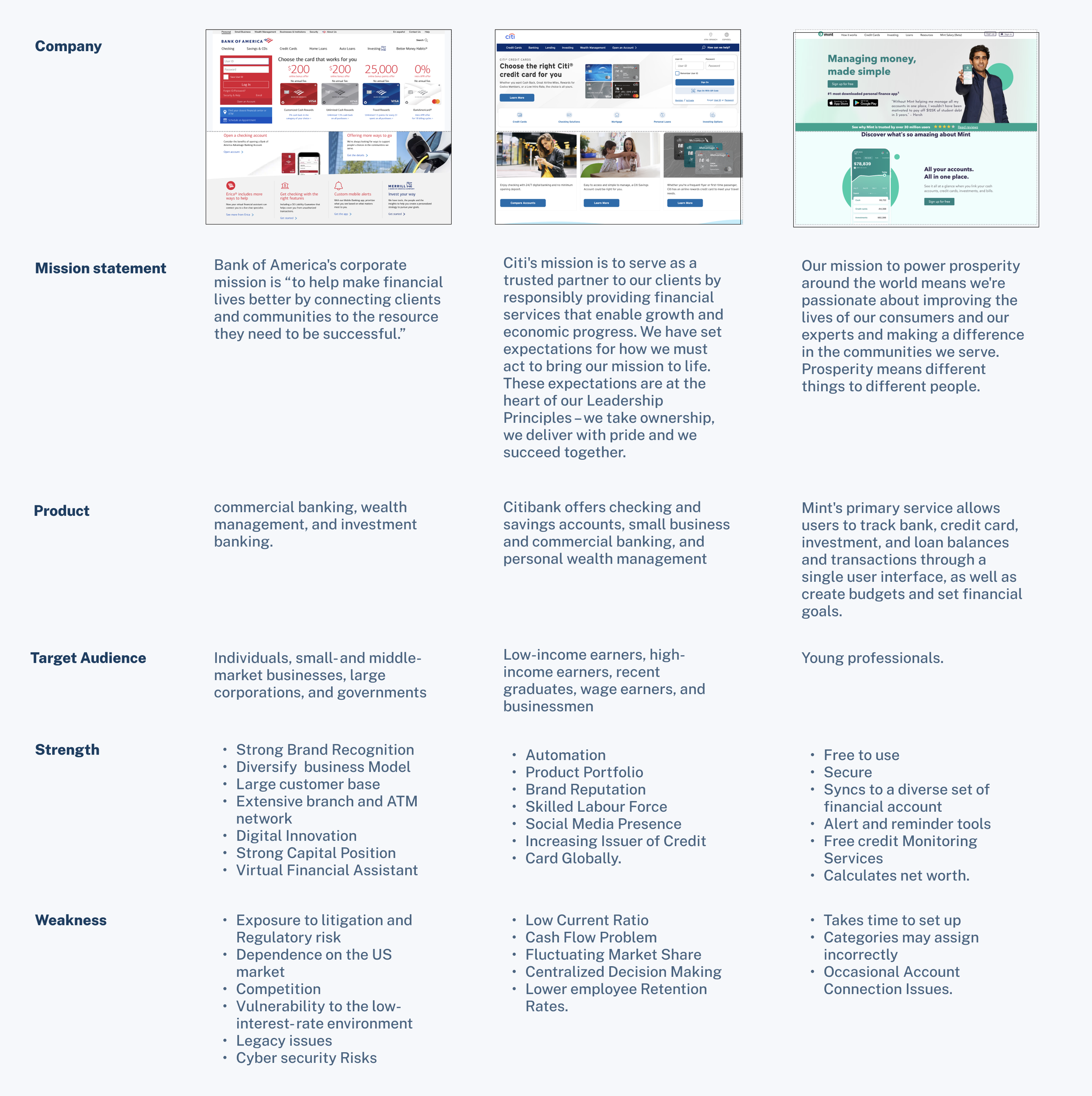
I began by conducting secondary research and performing a competitive analysis of banks and other financial institutions that offer a similar feature. Through this process, I discovered that there are 20 million users who utilize apps from other financial institutions to access a comprehensive overview of their accounts.
Secondary Research & Competitive Analysis
Affinity Map & 1 on 1 Interview

User Persona
After categorizing the key discussion points, I moved on to treating the users I interviewed as real personas to integrate into my entire design process. By closely observing the behaviors, habits, and objectives of each participant, i created a persona

Observing Alex journey in adding Non BOFA Account in Bank of America Account

Ideation
Before finalizing the specific steps for the user flows, I began by making rough sketches of the concepts I had in mind. This allowed me to compare them with the existing brand's functionality. After consolidating these ideas and refining them through wireframes, I then established the task flows, with a particular emphasis on areas of the user journey that required improvement.

Low Fidelity Wireframes
User Flow

High Fidelity Wireframes
After finalizing the layout of the user interface design components, I proceeded to transform the hand-drawn sketches into mid-fidelity wireframes. These wireframes were subsequently refined into high-fidelity screens, seamlessly integrating the brand identity. This process unified the visual aesthetics with the functional aspects of the user flows.
Splash Screen

Account Details

Information Page

Authorization Page

Login Page

Non BOFA A/C

Chase Bank Login Page

Non BOFA A/C Added

Prototype
Final Thoughts
Key Learnings
When introducing a new feature to an existing application, align it with the brand's initial vision and purpose. Ensure it enhances the product and serves its audience well. The feature should maintain the brand's identity while offering distinct value.
Introduce new features gradually to avoid overwhelming users. By taking small steps, users can adjust and see how the feature benefits them in unexpected ways. This approach helps users adapt gradually and understand the feature more easily.
More Case Studies

Lunch Lineup

Makenna Koffee Company

Skillhance